How to Brand your Community
Tonight's blog comes to us from our friends at Studio C & G and Teatime Circus! Christina and her husband Gabe dissect the infamous crossed X logo that we can't help but see incorporated into a myriad of logos including our own. Throughout this article, Christina and Gabe research the origin of the crossed X, where it comes from and what it means. We were thrilled to find out the crossed X has a lot to do with community and matches our expressed love for hometown pride.
Please read and enjoy!
How to Brand Your Community
We see it everywhere, the crossed X. Whether it's a well-defined X, or formed by other intersecting objects, brands have embraced the simple symmetry of the X in their logos. In Calgary where we live and work, you will definitely see the crossed X on the streets, chests and heads of locals. The YYC surrounding the crossed X is the work of local apparel company, Local Laundry, and features prominently in their designs.
While many have dubbed the crossed X a mark of hipster culture, this blasé categorization undermines the importance of logos to brand identity. More than a mark to put on products and Instagram, a brand’s logo is both practical identification and subliminal messaging.
Where does the crossed X come from, and why does it resonate with so many people? In researching its history, we can gain some insight about why it’s become so popular today.
The Origins of the Crossed X
Most sources state that the modern crossed X has its roots in New York Hardcore. Originally a mark on hands of underage show attendees, the crossed X became a part of the marketing for one of the local hardcore bands. Featured on hand drawn posters, it was only a matter of time before the crossed X would evolve into the NYHC logo.
New York Hardcore is described as territorial in nature, and so the NYHC logo not only became a mark of the music, but of the community and its native style. The original artist for the logo notes the design was born from the pride he felt for his hometown of NYC. Such civic loyalty is obvious in how prominently the letters N, Y, H, and C are displayed around the simple crossed X. With that frame of reference in mind, it’s easy to see why community-focused companies are so in love with its use.

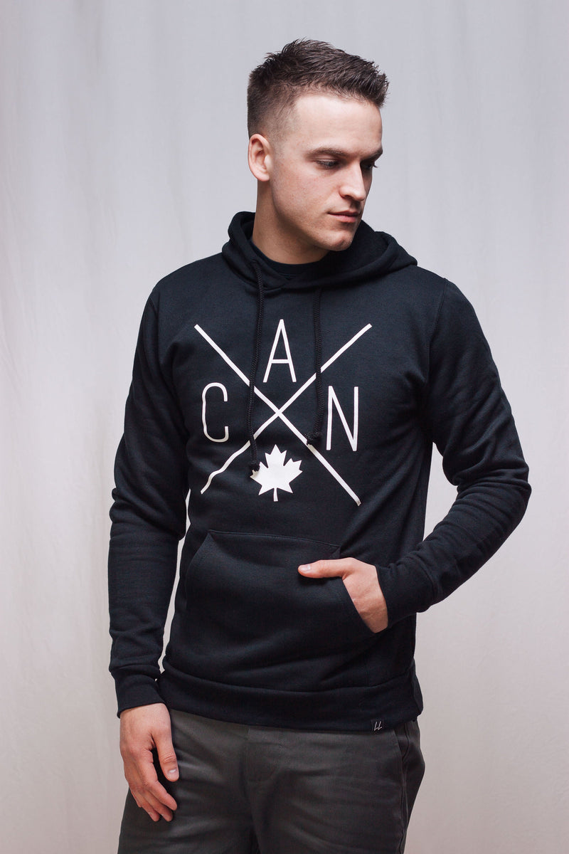
The Local Laundry YYC Logo
If logos are both an overt message and a subliminal one, then Local Laundry has communicated their message loud and clear. The company started as a way for its founder, Connor Curran, to express his own love for the city, and has evolved into a business that strives to build community through clothing. Over time, their efforts have attracted likeminded people to the cause, and has even resulted in the team building a small community of their own, focused on entrepreneurship and local love.
For Local Laundry, the crossed X is a perfect symbol for their designs. The crossed X already has a history of representing hometown pride, so using it as the focus of Local Laundry’s main design helps underpin their love for Calgary. The use of airport call signs is not only a great design choice given the available real estate, but also represents a language that is universally understood. No matter what language you speak, or where you come from, YYC will always be YYC.
By combining these two elements, Local Laundry’s city design communicates both an overt message, as well as a subconscious one about community.
For more design tips and advice, come visit us at StudioCandG.com!
Back to Kathleen here! If you are someone you know would like to be a guest blogger on our blog drop us a line! Chat at chaaa next week Calgary - stay local!
PSST I have a brand new blog up on my personal blog ‘That Awkward Dating Moment’ and if you’re already lurkin’ on social media follow me on Instagram @kathleensmiles_


